


The future of office design
Discover how colour in office design influences office wellbeing, working productivity, acoustics, and employee experience
For decades, office design followed one dominant rule: neutrality equals professionalism. White walls, grey carpets, concrete finishes, glass partitions, and monochromatic furniture became the universal language of corporate interiors. The office was meant to disappear into the background — efficient, clean, and emotionally invisible.
Today, that philosophy feels outdated.
Modern workplaces are no longer designed merely as functional containers for desks and screens. They are environments that directly influence office wellbeing, working productivity, creativity, emotional regulation, and social interaction. Architects and interior office designers increasingly recognise that employees do not simply “work” in offices — they experience them emotionally, cognitively, and physically throughout the day.
This shift has elevated colour in office design from decoration to a strategic element.
Colour now plays a critical role in how employees navigate spaces, manage concentration, recover from overstimulation, collaborate effectively, and feel psychologically safe. Yet successful office design is not about simplistic colour psychology clichés. Blue does not universally calm. Yellow does not automatically energise. In reality, colour only functions effectively when combined with acoustics, lighting, texture, materiality, and spatial purpose.
The future of office design lies in this integration.
Brands like Flexxica demonstrate how colour, acoustic comfort, and lighting can work together to create workspaces that are both emotionally intelligent and operationally effective. Their approach reflects a broader transformation in workplace architecture: the shift from static offices to responsive environments designed around the human experience.
Why neutral offices no longer work
The rise of minimal corporate interiors emerged from a desire for universality. Neutral colours were considered safe, timeless, and unobtrusive. In theory, they allowed employees to focus entirely on work without distraction.
But neutral environments often create another problem: emotional disengagement.
Research in environmental psychology increasingly shows that sterile office spaces can contribute to fatigue, reduced creativity, and sensory monotony. When every surface reflects the same palette and texture, the workplace lacks rhythm, contrast, and emotional depth.
Modern employees expect more from the office than functionality alone.
The hybrid work era accelerated this transformation dramatically. Since many tasks can now be completed remotely, the office must justify its existence through experience. Employees return not because they need a desk, but because they seek collaboration, inspiration, social interaction, better acoustics, and environments that support concentration more effectively than home settings.
Colour becomes essential in creating this emotional and functional differentiation.
A thoughtfully designed office can energise movement areas, calm focus zones, soften transitions between departments, and create a stronger sense of identity. Rather than being invisible, office interiors now actively shape workplace culture.
The psychology of colour in office design
Colour influences people before they consciously notice it. It affects spatial perception, emotional regulation, behavioural patterns, and even physical comfort.
In office design, colour can:
- Encourage collaboration
- Reduce visual fatigue
- Improve orientation
- Define work zones
- Create emotional warmth
- Lower perceived stress
- Support cognitive focus
However, contemporary workplace design moves beyond simplistic colour associations.
Beyond simplistic colour theory
Traditional office colour theory often relied on oversimplified assumptions:
- Blue = calm
- Red = energy
- Yellow = optimism
- Green = balance
In reality, colour perception depends heavily on context.
A deep navy blue on a hard reflective wall may feel cold and corporate. The same blue applied to soft acoustic felt under warm lighting may create intimacy and psychological comfort. Similarly, orange can stimulate communication in transition areas but become overwhelming in brightly lit focus zones. Red can signal importance and attract attention when used selectively, yet dominate the environment if overapplied. Successful office design, therefore, treats colour as relational rather than as an isolated element.
Architects must consider:
- Material texture
- Surface reflectivity
- Acoustic performance
- Lighting temperature
- Spatial proportions
- User behaviour
- Cultural interpretation
Colour is not decoration layered onto a completed project. It is part of the workflow architecture itself.
Colour as a functional design language
In modern office design, colour increasingly acts as a navigational and organisational system. Employees intuitively read environments through visual cues long before encountering signage. Colour can indicate where people should collaborate, focus, relax, or move quickly through circulation paths.
For example:
|
Colour Application |
Functional Impact |
|---|---|
| Saturated blues | Concentration and private discussion |
| Warm orange transitions | Movement and energy |
| Soft greens | Regeneration and stress reduction |
| Accent reds | Attention and activation |
| Neutral warm tones | Emotional stability |
This spatial coding becomes particularly valuable in hybrid offices where employees may not occupy fixed desks daily.
Creating intuitive spatial navigation
In flexible workplaces, employees move constantly between:
- Focus areas
- Collaboration spaces
- Meeting rooms
- Lounge zones
- Teleconference booths
- Informal gathering spaces
Colour helps users navigate these transitions subconsciously. A warm-toned corridor may encourage movement and interaction, while darker, muted tones in quiet zones can psychologically slow the pace and reduce overstimulation. This subtle guidance reduces cognitive load and improves overall working productivity.
Office wellbeing and sensory experience
The conversation around office wellbeing has evolved beyond ergonomic chairs and standing desks. Today, well-being includes sensory comfort. Employees continuously process environmental stimuli such as:
- Sound
- Light
- Contrast
- Colour saturation
- Movement
- Spatial density
- Material texture
Poorly designed offices often overload these sensory systems, leading to stress, distraction, and fatigue.
Neurodiversity in modern office design
Neurodiversity is no longer a niche discussion in workplace architecture. It reflects a growing awareness that employees perceive environments differently. What feels stimulating and inspiring for one person may feel overwhelming for another. Open-plan offices especially highlight these differences. For some employees, energetic collaborative spaces improve motivation. For others, constant visual movement, noise, and colour intensity create cognitive exhaustion. This is why modern office design must prioritise choice.
Designing for Choice Rather Than Control
The best workplaces do not enforce one universal way of working. They offer varied environments that employees can select based on their tasks, moods, and sensory needs. Colour supports this flexibility by helping define emotional gradients across the office.
For example:
- Muted tones in focus areas reduce distraction
- Warm colours in social spaces increase engagement
- Natural greens support mental recovery
- Soft materials visually communicate comfort and calmness
The office becomes a responsive ecosystem rather than a rigid corporate landscape.
Colour and working productivity
Productivity is closely tied to environmental conditions.
Distractions, poor acoustics, harsh lighting, and visual monotony all reduce cognitive efficiency. Colour can either amplify these problems or help resolve them.
The relationship between colour and cognitive performance
Different tasks require different cognitive states. Deep analytical work benefits from environments that reduce overstimulation. Brainstorming sessions may benefit from more energetic visual environments. This means office colour palettes should vary according to function rather than remain uniform throughout the workplace.
For instance:
- Quiet work pods may use darker desaturated tones
- Collaboration zones may introduce a higher colour contrast
- Lounge areas may rely on earthy materials and biophilic palettes
- Transitional areas may use brighter colours for orientation
Strategic variation improves both focus and psychological engagement.
Where colour meets acoustics
One of the most important developments in contemporary office design is the integration of acoustics with visual identity.
Modern offices contain numerous acoustically challenging materials:
- Glass
- Concrete
- Raised ceilings
- Metal surfaces
- Large screens
- Open-plan layouts
While visually striking, these surfaces reflect sound aggressively. Noise is one of the biggest threats to office well-being and productivity.
Acoustic design as a visual experience
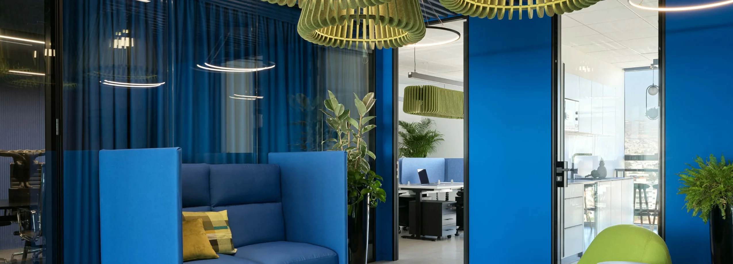
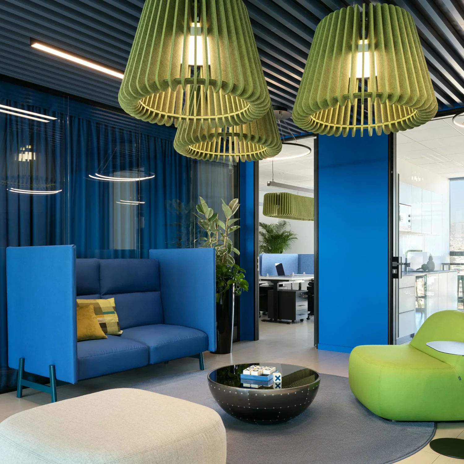
This is where companies like flexxica redefine workplace solutions. Instead of treating acoustic elements as mere technical necessities, Flexxica integrates them into the office's visual identity. Their ecoPET acoustic luminaires, upholstered lighting fixtures, and felt panels simultaneously:
- Absorb sound
- Shape colour experience
- Define zones
- Improve visual warmth
- Enhance lighting quality
An upholstered acoustic pendant light can become both a sculptural focal point and a functional sound absorber. Similarly, wall panels can organise interior aesthetics while reducing reverberation across open-plan spaces. This integrated approach creates offices that not only look better but also sound better.
The role of lighting in colour perception
Colour never exists independently of light.
The same material can appear dramatically different depending on:
- Light temperature
- Intensity
- Direction
- Surface finish
- Time of day
Why lighting cannot be separated from colour
A navy blue surface under warm light may feel luxurious and calming. Under cool lighting, it may appear rigid and corporate. Orange tones may create welcoming energy in soft ambient conditions, but become visually exhausting under excessive brightness. This is why architects and interior office designers must evaluate colour palettes alongside complete lighting strategies. flexxica’s integrated lighting and acoustic systems demonstrate how illumination and materiality can work together rather than compete.
Successful office design requires a balance between:
- Colour
- Light
- Texture
- Acoustics
- Spatial behaviour
Without this integration, even visually attractive offices can become uncomfortable to inhabit over the long term.
flexxica’s approach to modern office design
flexxica represents a new generation of workplace design thinking where aesthetics and functionality are inseparable.
Their product range includes:
- ecoPET acoustic luminaires
- Felt lighting systems
- Upholstered acoustic lamps
- Pendant lighting
- Wall-mounted acoustic fixtures
- Floor lamps
- Acoustic accessories
These solutions address real workplace challenges while contributing to a strong visual identity.
Integrating colour, light, and silence
What distinguishes Flexxica’s approach is the understanding that office wellbeing depends on sensory harmony. Instead of prioritising visual impact alone, their systems combine:
- Acoustic comfort
- Lighting quality
- Material softness
- Colour strategy
- Spatial zoning
This holistic methodology allows offices to feel emotionally engaging without becoming overstimulating. In the best contemporary workplaces, colour does not aggressively dominate attention. It quietly guides behaviour, supports mood, and improves spatial understanding.
Colour in hybrid workspaces
Hybrid work transformed employee expectations permanently. If employees can complete routine tasks from home, the office must offer additional value. That value increasingly comes from experience. The most successful workplaces now provide:
- Better acoustics
- Higher-quality lighting
- Stronger social energy
- Flexible spatial options
- Emotional comfort
- Distinct identity
Colour becomes part of the return-to-office strategy. Not through forced corporate branding, but through creating environments employees genuinely enjoy inhabiting. Warm collaborative zones encourage spontaneous interaction. Focus rooms offer calmness and privacy. Lounge areas support informal communication and recovery between meetings. The office evolves into a destination rather than an obligation.
Emotional design in the workplace
Humans need sensory stimulation, but balanced stimulation. Offices that feel overly clinical can reduce emotional connection and creativity. Conversely, chaotic environments increase cognitive fatigue. The goal of modern office design is emotional equilibrium.
A well-designed workplace can be:
- Bold yet calming
- Functional yet sensual
- Efficient yet human-centred
- Visually dynamic yet acoustically soft
Colour plays a central role in achieving this balance. Architects and interior office designers increasingly understand that emotional comfort is not a luxury feature. It directly affects employee retention, the quality of collaboration, and overall workplace performance.
Best practices for architects and interior office designers
To create truly effective office environments, designers should approach colour strategically rather than decoratively.
Key design recommendations
1. Design Colour Alongside Acoustics
Never treat acoustic solutions as separate technical additions.
2. Use Colour to Define Behaviour
Support different cognitive activities through zoning.
3. Prioritise Sensory Diversity
Create varied environments for neurodiverse needs.
4. Integrate Lighting Early
Evaluate colour palettes under real lighting conditions.
5. Balance Stimulation and Calmness
Avoid both sensory monotony and visual overload.
6. Think Beyond Branding
Colour should support human behaviour, not only company identity.
Frequently Asked Questions
1. How does colour influence working productivity in office design?
Colour affects concentration, emotional regulation, navigation, and stress levels. Strategic use of colour can improve focus, collaboration, and overall working productivity.
2. Why is office wellbeing important in modern workplaces?
Office wellbeing directly impacts employee satisfaction, mental health, retention, creativity, and performance. Sensory comfort plays a major role in workplace quality.
3. How do acoustics and colour work together in office design?
Acoustic materials like felt panels and upholstered lighting fixtures can simultaneously improve sound comfort and create visual warmth through colour integration.
4. What colours work best for focus areas?
Muted blues, earthy tones, and low-contrast palettes often support concentration by reducing visual overstimulation.
5. Why is neurodiversity important in office design?
Different people process sensory stimuli differently. Offices should provide varied environments to accommodate diverse cognitive and emotional needs.
6. What role does lighting play in colour perception?
Lighting dramatically changes how colours appear emotionally and visually. Colour strategies must always be evaluated alongside lighting design.
The future of office design is no longer white, grey, or emotionally neutral. It is consciously designed around human experience. Colour now functions as more than decoration. It shapes office well-being, supports productivity, improves navigation, enhances acoustics, and strengthens the emotional connection to the workplace. For architects and interior office designers, the challenge is no longer choosing attractive palettes. It is creating environments where colour, light, acoustics, texture, and functionality operate together as one cohesive system. flexxica’s integrated approach clearly reflects this future: offices designed not simply to look professional, but to feel better, sound better, and work better for the people inside them. Because the most effective workplaces are not those that disappear into the background. They are the ones that quietly help people thrive.
For more insights into workplace wellbeing and acoustic office solutions, visit https://flexxica.com/
More news
See all
flexxica at ORGATEC 2026
See flexxica products at ORGATEC 2026, taking place from October 27–30, 2026, at the Koelnmesse trade fair centre in Cologne, at the Glass System stand.
flexxica at Architect@Work Paris 2026
flexxica will be exhibiting at Architect@Work Paris on 21–22 October 2026 at the Grande Halle de la Villette. Come and see our acoustic lighting solutions in person.


