


Office lighting colour temperature: 3000K, 3500K or 4000K?
How to choose the right CCT for every zone in your office and why this single decision shapes everything from visual comfort to the character of the space.
The decision that changes everything
There is a moment in every office lighting project when the specification moves beyond lux levels and installation grids, and the conversation turns to colour temperature. It is the decision that most dramatically shapes how a finished space feels, not just how well it performs technically, but whether the people working in it feel alert or drowsy, comfortable or clinical, welcomed or merely processed.
And yet it is also, surprisingly often, the decision that receives the least considered attention. Colour temperature gets treated as a default rather than a choice. A value of 4000K gets specified because it always has been, or because it matches what was done in the last project, or because the product range happened to default to it. The result is offices that function adequately but never quite feel right: spaces where something is subtly off, where the light neither supports the work nor enhances the architecture, and where nobody can quite put their finger on why.
At flexxica, we spent years thinking about how light behaves in professional interiors, and we want to make a case for treating office lighting colour temperature as one of the most consequential design decisions on the project because it genuinely is.
What does correlated colour temperature actually mean?
Before going further, it is worth being clear about what we are actually discussing when we talk about Correlated Colour Temperature, or CCT. The term is technical, but the underlying concept is straightforward: CCT describes the visual character of white light, measured in Kelvin (K), and specifically whether that light appears warm, neutral, or cool.
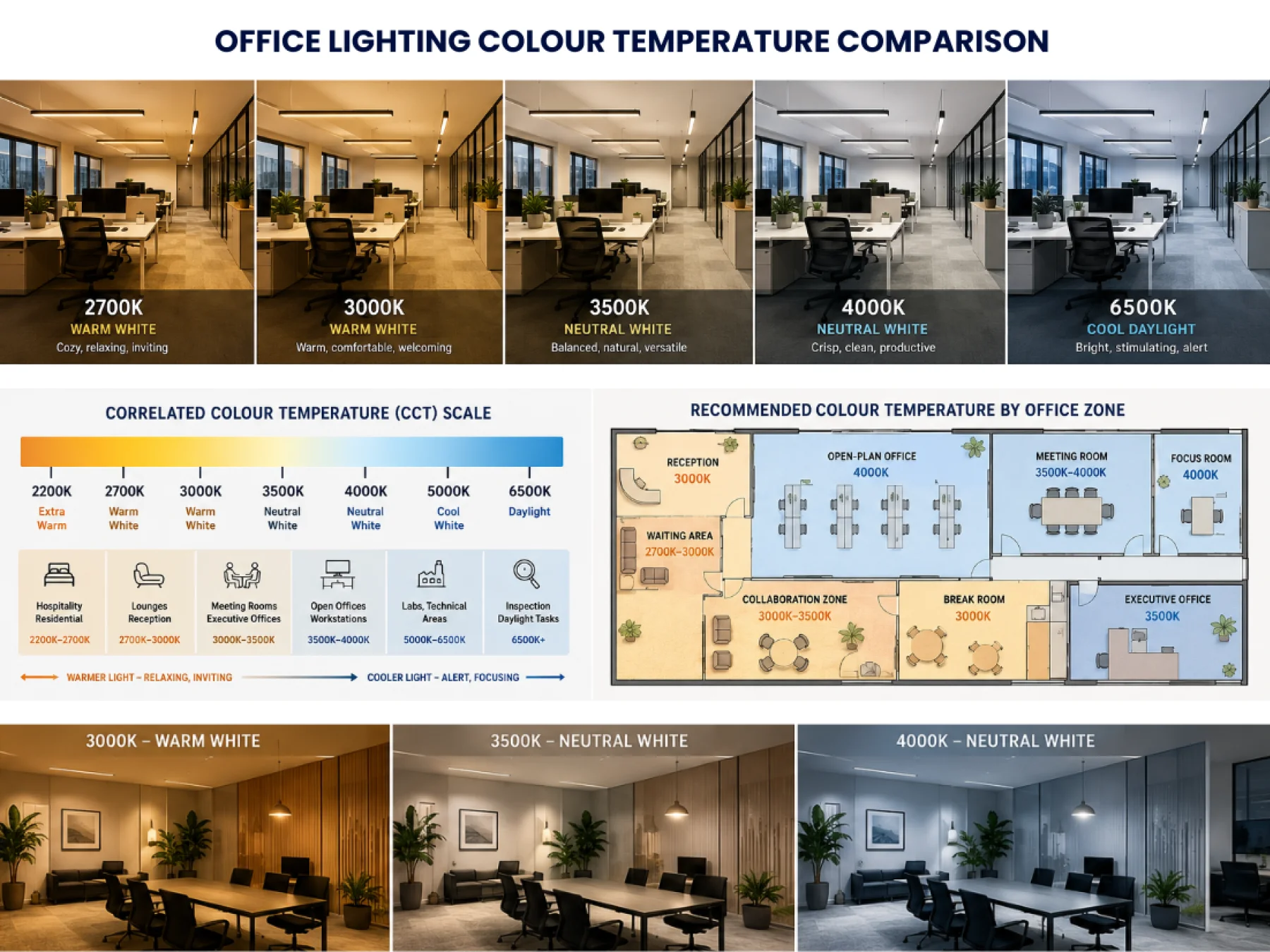
A lower Kelvin value, 2700K, produces light with a distinctly warm, yellowish quality, similar to a traditional incandescent lamp. As the Kelvin value rises, the light progressively shifts toward a more neutral white, then into a cooler, bluer appearance. At 6500K, the light approximates the quality of overcast northern daylight: very cool, very blue-white, and extremely crisp.
Critically, CCT does not describe brightness. A 2700K lamp and a 4000K lamp can produce identical lux levels. What differs is the visual character of the illumination, and that character has a profound effect on both how the space looks and how people feel working in it. The formal definition and measurement methodology for CCT is established by the CIE (International Commission on Illumination), the body that sets the foundational standards for lighting science internationally. Their technical definitions underpin everything that follows in this article.
In the context of professional interiors, Correlated Colour Temperature (CCT) office lighting typically operates between 3000K and 4000K, with the precise value chosen depending on the function of the space, the character of the interior, the presence of natural daylight, and the activities the room is designed to support. Understanding why these relatively small numerical differences matter so much requires understanding the full spectrum from the warmest residential-grade sources all the way to the coolest industrial-grade daylight approximations.
The full spectrum: from candlelight to daylight
It helps to think of colour temperature as a continuous scale, with each section telling a different story about the environment it creates.
At the warm end, around 2200K to 2700K, we are in the territory of candlelight and classic incandescent lamps. Light at this temperature is visibly yellow, intimate, and inherently relaxing. It is the quality of light that makes restaurants feel welcoming, hotel lobbies feel luxurious, and sitting rooms feel like home. This is not accidental - warm light at these temperatures genuinely affects human physiology, signalling to the body that the intensity of the day is winding down and that rest is approaching. For office environments, 2700K is rarely appropriate for workstations, but it has a genuine role in specific zones: relaxation rooms, executive lounges, hospitality reception areas where the priority is to make visitors feel immediately at ease, and cafeteria spaces where people need genuine psychological separation from formal work.
Moving into the 3000K range, the light becomes slightly less yellow while retaining its warmth. This is the temperature most commonly used in upscale retail, boutique hospitality, and creative studios where the atmosphere of the space is as important as its functionality. For offices, 3000K occupies an interesting position - warm enough to feel inviting and human, but not so warm that it compromises visual performance for sustained work. Whether 3000K works in a given office context depends very much on the character of the interior, the preferences of the occupants, and the nature of the work being done.
At 3500K, we arrive at what many professional lighting designers consider the most sophisticated position on the scale, the point where the warmth of a welcoming environment and the crispness of a functional workspace are held in balance. It is a temperature that requires some experience to appreciate fully, because at first glance it can seem like a compromise between two clearer options. In practice, it is often the reverse: 3500K is the temperature that makes a premium office feel genuinely premium, rather than either cosy or corporate.
The 4000K range represents the neutral white that has become the commercial standard for a reason. Light at this temperature is clean, clear, and natural-looking without being cold. It renders colours accurately, supports sustained visual work without causing fatigue, and creates the kind of environment that feels professional without feeling inhospitable. For most open-plan office environments, 4000K remains the most reliable default, though, as we will explore, it is far from the right answer for every zone.
Above 4000K, the light becomes progressively cooler and more blue-tinged. At 5000K, we are in the territory of specialist environments: laboratories, inspection facilities, healthcare settings, and industrial quality control, where the priority is maximum visual acuity and colour accuracy under very controlled conditions. At 6500K, the light approximates the blue-white quality of overcast northern daylight and is used primarily in graphic inspection, printing, and colour-matching applications. For standard office work, these temperatures are almost never appropriate. Prolonged exposure to very cool light in a sedentary work environment creates an atmosphere that most people find tiring and vaguely unpleasant: technically bright but experientially cold.
Why does it matter more than most people realise?
Employees in most office environments spend the majority of their working hours under artificial light. Over the course of a day and certainly over weeks, months, and years, the quality of that light has a cumulative effect on visual comfort, mood, alertness, and general wellbeing. A poorly chosen colour temperature does not create a dramatic problem that is easy to identify and fix. It creates a persistent, low-level discomfort that people adapt to rather than address, and that subtly erodes both satisfaction and performance over time.
This is not a matter of subjective opinion. The performance requirements for workplace lighting — including illuminance levels, glare control, and colour rendering are formally defined in EN 12464-1, the European standard for the lighting of indoor workplaces (which mirrors the international ISO 8995 standard). While EN 12464-1 does not mandate a specific colour temperature for every application, it establishes the framework within which CCT decisions should sit — a framework built on the principle that lighting must support the visual tasks and the wellbeing of the people performing them, not simply meet a minimum threshold. Any serious office lighting specification should be developed with reference to this standard.
Beyond compliance, the Illuminating Engineering Society (IES) publishes extensive guidance on the relationship between colour temperature, visual performance, and occupant comfort across different workplace contexts. Their research consistently reinforces what experienced designers observe in practice: that CCT selection affects not just visibility but alertness, mood, and the subjective quality of the environment — all of which have measurable consequences for how effectively people work.
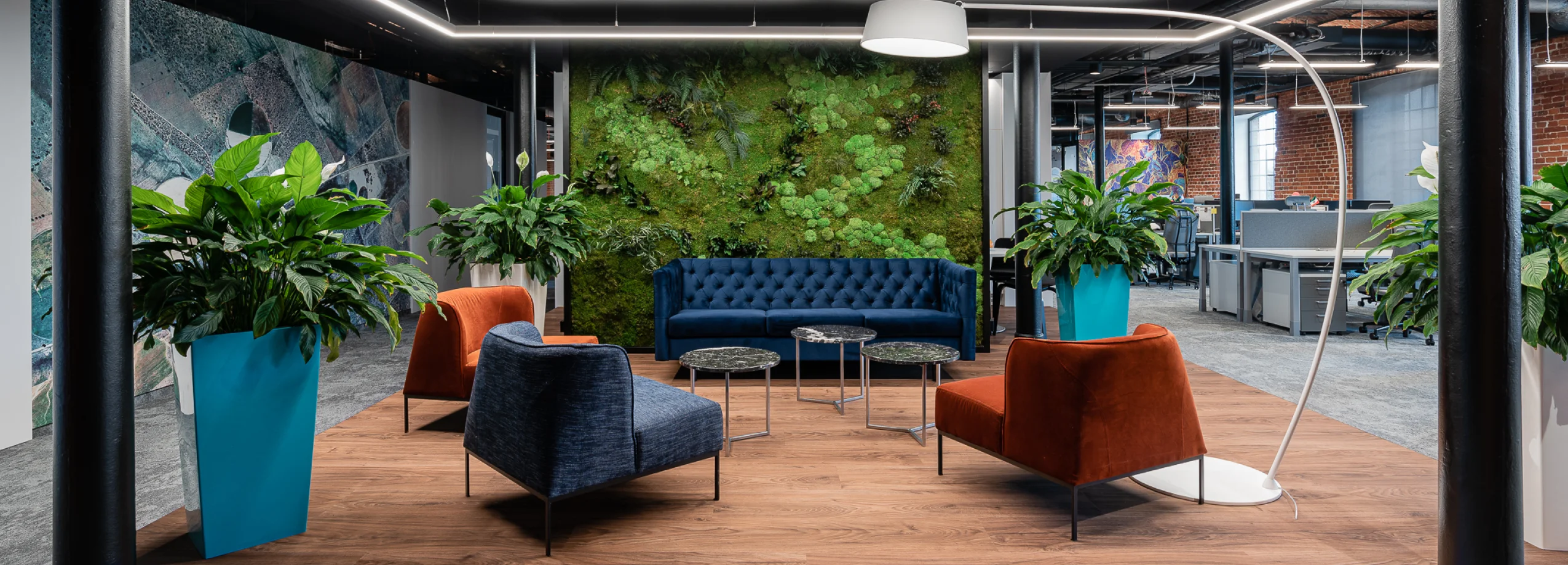
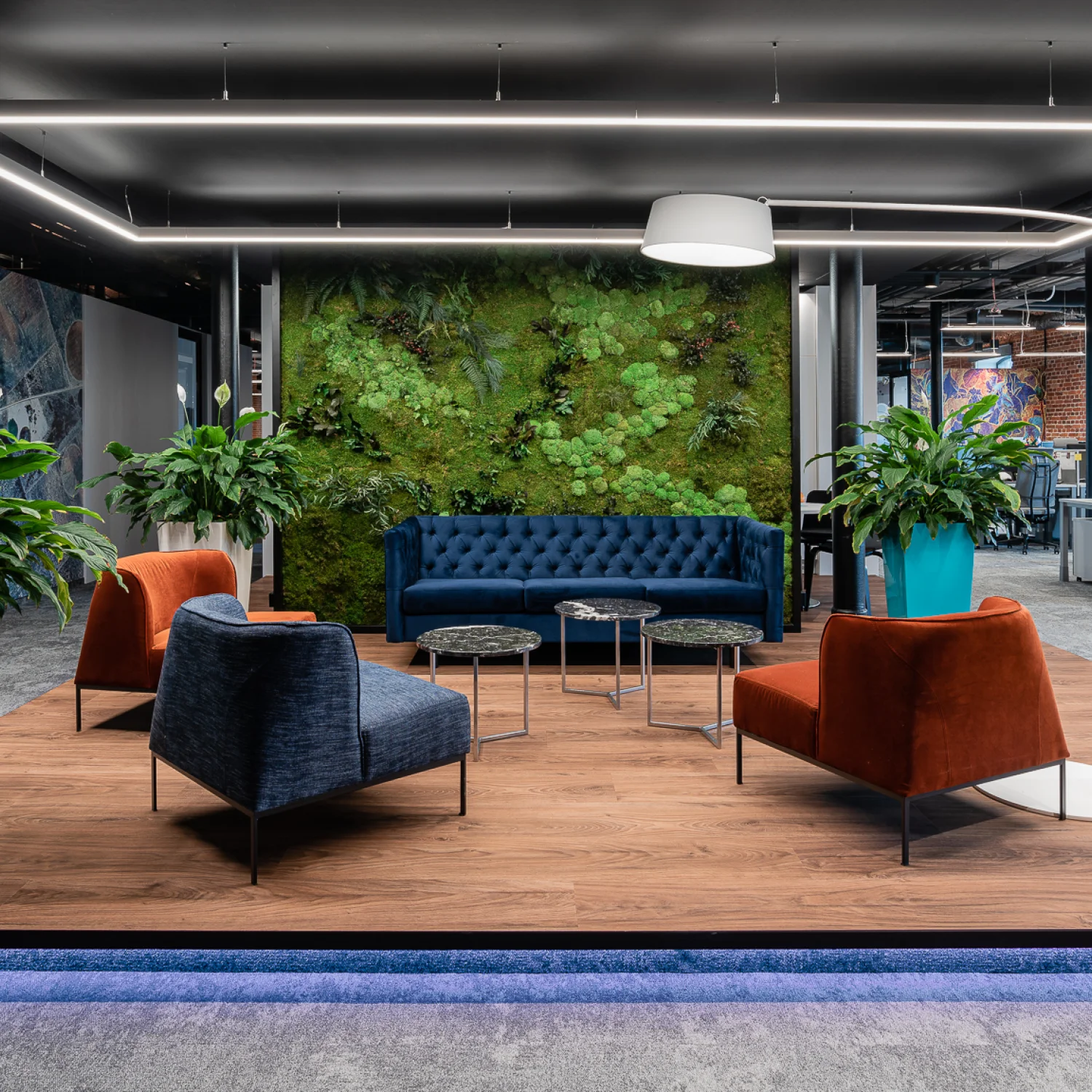
There is also the question of how colour temperature interacts with interior design. Light at 3000K makes warm timber finishes glow and enriches earthy colour palettes; the same material under 4000K reads as slightly flatter and more commercial. Concrete surfaces, conversely, often benefit from the cooler clarity of 3500K or 4000K, which brings out their texture and weight without making them feel cold. White interiors shift significantly across the temperature range, appearing warm and residential at 3000K, balanced and refined at 3500K, crisp and clean at 4000K, and uncomfortably sterile above that. Black finishes and dark furniture generally perform best under neutral white, which preserves their depth without adding either warmth or coolness. For projects incorporating biophilic design elements indoor plants, natural stone, living walls the 3500K to 4000K range tends to produce the most vivid and natural appearance.
These material interactions are not incidental details. They are the reason why office lighting colour temperature needs to be decided in dialogue with the interior design, not after it.
3000K: When warmth is the point?
The case for 3000K office lighting is strongest in environments where atmosphere and experience are primary objectives rather than byproducts. Creative agencies, design studios, boutique coworking spaces, and hospitality-influenced workplaces often benefit enormously from the warmth that 3000K provides. In these contexts, the slightly yellowish quality of the light is not a performance compromise; it is a deliberate design choice that reinforces the character and culture of the organisation.
3000K also works exceptionally well in reception areas, where the first impression of a building matters and where making visitors feel welcomed immediately is more important than providing optimum conditions for reading small print. Waiting areas, informal meeting lounges, coffee points, and break rooms are all strong candidates for 3000K, particularly in offices that are otherwise specified at a higher colour temperature. The contrast between the warmth of the social spaces and the neutrality of the work zones helps people make the psychological transition between focused work and genuine rest, which is both more comfortable and more restorative.
The WELL Building Standard, developed by the International WELL Building Institute (IWBI), addresses the relationship between light and human health in considerable depth. WELL's Light concept includes requirements and optimisation credits related to colour temperature and its effect on circadian rhythms, mood, and cognitive performance — and the standard's framework consistently supports the principle that warmer light has a physiologically different effect on occupants than cooler light, an effect that should be intentionally designed for rather than ignored. For organisations pursuing WELL certification, CCT selection is a specific area of technical scrutiny rather than a stylistic detail.
What 3000K is not particularly suited to is sustained, detail-intensive visual work. For screen-based tasks, administrative processing, or any activity requiring prolonged reading, the warmth of 3000K can feel slightly heavy over time, and many people find they are slightly less alert under it than under a more neutral source. This is worth factoring into zone specifications rather than treating as a reason to avoid 3000K entirely.
3500K: The designer's frequency
Among the lighting designers we respect most, 3500K is consistently cited as the most underused and underappreciated colour temperature in the commercial range. It occupies a position that is genuinely distinctive rather than merely transitional: warm enough to feel human, neutral enough to feel professional, and refined enough to work in almost any premium interior context.
The applications where 3500K performs particularly well are those where the visual impression of the space matters as much as its functional performance. Executive offices, boardrooms, conference rooms, and high-end headquarters benefit from the elevated atmosphere that 3500K creates a light that says something has been carefully considered, rather than simply installed. In meetings, 3500K produces excellent facial rendering, which is increasingly important given how much time people spend in hybrid video environments where the quality of facial illumination is visible to remote participants.
3500K also integrates more gracefully with natural daylight than either 3000K or 4000K in many contexts. The balanced position of 3500K on the warm-to-cool scale means that it neither clashes with warm afternoon light nor reads as significantly different from cool morning light; it adapts, contextually, to the changing quality of daylight in a way that more extreme values do not. The CIE's guidance on daylight integration in interior environments supports this approach, emphasising the importance of maintaining coherence between artificial and natural light sources across the working day.
For architects and interior designers working on premium office projects who have not yet fully explored 3500K, we would genuinely encourage the experiment. It is the colour temperature that most consistently surprises clients when they see the completed space; it's obviously different from what they expected, and it simply feels better than they anticipated.
4000K: The commercial standard and when it deserves to be
There is a reason 4000K has become the benchmark for commercial office lighting, and that reason is genuine. Neutral white at 4000K is an excellent solution for open-plan work environments. It provides crisp visibility without visual harshness, supports prolonged screen-based work, renders the neutral colours typical of modern commercial interiors accurately, and creates the kind of clean, unobtrusive environment that allows people to focus on their work rather than the space around them.
For large open-plan offices, 4000K is typically the right starting point. It is comfortable for extended periods, compatible with most monitor brightness levels, and compliant with European workplace lighting standards when combined with appropriate lux levels and glare control. It also works well in focus rooms, individual workstations, technical workspaces, and any zone where the primary requirement is sustained concentration rather than atmosphere or social interaction.
The IES Lighting Handbook, the most comprehensive reference document in professional lighting practice, provides detailed recommendations for workplace illumination that consistently position neutral white sources in the 3500K to 4000K range as the most appropriate for sustained visual work. The reasoning is both physiological and practical: at this temperature, the eye perceives colours with reasonable accuracy, the visual system operates without undue stress, and the environment supports the kind of prolonged, detailed attention that knowledge work requires.
The mistake is not specifying 4000K for open-plan work. The mistake is specifying 4000K everywhere for reception, for the boardroom, for the break room, for the waiting area because it is the default, requires no particular justification, and nobody will complain about it directly. The result is an office that is perfectly functional and entirely forgettable, a place where the lighting supports the tasks but does nothing for the people performing them.
Integrating colour temperature with daylight
One of the most important variables in any office lighting specification is the relationship between artificial light and natural daylight, and this relationship changes significantly across the day, across the year, and across different building orientations.
North-facing offices typically receive cool, diffuse daylight that lacks the warmth and directional quality of sun-facing aspects. In these spaces, slightly warmer artificial lighting 3000K or 3500K can compensate for the coolness of the natural light and prevent the space from feeling permanently cold and grey. South-facing offices, particularly those in climates with strong solar gain, often receive abundant warm afternoon light that can clash with very warm artificial sources; 4000K typically integrates more naturally in these contexts.
The integration of daylight also raises the question of circadian lighting systems that adjust colour temperature across the day to support the body's natural alertness cycle. The WELL Building Standard's Light concept includes specific requirements for circadian light exposure, reflecting the growing body of research linking light quality across the day to sleep quality, cognitive performance, and long-term health outcomes. The IWBI's technical documentation provides detailed guidance on how circadian-supportive lighting should be specified and measured in professional environments. These systems deliver cooler, higher-intensity light during peak morning and early afternoon hours to support alertness, and gradually shift toward warmer, lower-intensity output as the afternoon progresses. For organisations that are serious about employee wellbeing and sustained cognitive performance, circadian-responsive lighting available in the Flexxica Professional Lighting range represents one of the most meaningful investments available in contemporary office specification.
Zone by zone: a practical guide
Translating all of this into practical decisions means thinking about each zone of the office as a distinct environment with distinct requirements, each with its own position within the framework established by EN 12464-1 and informed by the broader wellbeing principles of the WELL Building Standard.
- Reception areas deserve 3000K. The first few seconds of a visitor's experience set the tone for everything that follows, and warm light at the entrance of a building creates an immediate sense of welcome that neutral white cannot replicate.
- Open-plan workstations are where 4000K earns its reputation. Clean, neutral, consistent this is the environment that supports eight hours of screen-based work without creating either the drowsiness of warm light or the clinical edge of cool light.
- Executive offices and boardrooms are natural candidates for 3500K. These are spaces where presence and impression matter, where meetings are consequential, and where the quality of the environment reflects the quality of the organisation. 3500K delivers that quality without ostentation.
- Meeting rooms are context-dependent. For rooms used primarily for collaborative discussion and video conferencing, 3500K provides excellent facial rendering and a comfortable working atmosphere. For rooms used for intensive visual tasks, such as design reviews, technical presentations, and materials inspection, 4000K may be preferable.
- Collaboration zones and informal working areas benefit from 3000K to 3500K, which creates a slightly more relaxed register than the open-plan floor and encourages the kind of lateral thinking that structured workstations sometimes inhibit.
- Break rooms and cafeterias should sit at 2700K to 3000K. These spaces exist to provide psychological distance from formal work, and the warmth of the lighting is a significant contributor to that sense of separation.
The parameters beyond CCT
It would be incomplete to discuss office lighting colour temperature without acknowledging that CCT is one parameter among several, all of which interact to determine the quality of the final result.
The Colour Rendering Index (CRI) determines how accurately the light source reproduces the colours of objects, surfaces, and materials. A high CCT combined with a low CRI common in budget LED sources can produce light that appears reasonably neutral but renders colours poorly, making interiors feel flat and materials look dull. For premium office environments, a CRI of 90 or above is worth specifying regardless of colour temperature.
The Unified Glare Rating (UGR) measures the discomfort caused by visible light sources within the field of view. EN 12464-1 specifies a maximum UGR of 19 for most office tasks, a requirement that is frequently overlooked in product selection, but that has a significant effect on visual comfort over the course of a working day. Achieving UGR below 19 requires attention to luminaire design, optical distribution, and placement rather than simply CCT selection. The Flexxica Professional Lighting range of architectural luminaires is designed to address glare as a primary performance criterion alongside colour temperature and lux levels.
Uniformity: the even distribution of light across the working surface is equally important. Significant variation in illuminance across a workstation creates adaptive stress for the visual system as the eye constantly adjusts between brighter and darker areas, contributing to fatigue over the course of the day.
Light as a design decision
The most important thing we can say about office lighting colour temperature is this: it deserves to be treated as a genuine design decision rather than a specification default. The difference between a 3000K and a 4000K office is not a marginal one. It is the difference between an environment that feels warm and human and one that feels clinical and commercial. The difference between 3500K in a boardroom and 4000K in the same room is the difference between a space that says something and one that says nothing.
Contemporary office design increasingly recognises that environment affects performance; that the quality of the light people work under shapes not just how well they can see, but how they feel, how they communicate, and how much they want to be there. The standards that govern this field, from the CIE's fundamental photometric definitions, to EN 12464-1's workplace requirements, to the WELL Building Standard's human health framework, to the IES Lighting Handbook's practical guidance — all point in the same direction: light is not a background condition. It is an active determinant of how people feel and perform in the spaces we design for them.
Getting colour temperature right, zone by zone, in dialogue with the architecture and interior design, and informed by the best available technical guidance, is one of the most powerful tools for achieving that outcome.
The Flexxica Professional Lighting range of architectural luminaires is designed to support exactly this kind of considered, zone-specific approach — providing the photometric performance, CRI quality, and design refinement that professional office environments require across every point on the colour temperature scale.
Frequently Asked Questions
What is the best office lighting colour temperature?
For most workplaces, 3500K–4000K provides the best balance between visual comfort, concentration, and natural appearance.
Is 3000K suitable for offices?
Yes. 3000K office lighting works particularly well in reception areas, collaboration spaces, hospitality-inspired offices, and relaxation zones where a welcoming atmosphere is preferred.
Why is 4000K commonly used in offices?
Neutral white 4000K office lighting provides excellent visibility, supports prolonged computer work, and creates a clean, professional environment suitable for most commercial workplaces.
What is Correlated Colour Temperature (CCT)?
Correlated Colour Temperature (CCT) measures the visual colour appearance of white light in Kelvin (K), ranging from warm yellowish tones (around 2700K) to cool bluish daylight (around 6500K).
Should every office use the same colour temperature?
No. Different office zones have different functions. Reception areas, meeting rooms, open-plan offices, focus rooms, and break spaces each benefit from tailored colour temperature selections.
Is 6500K recommended for office work?
Generally, no. While 6500K is useful for specialised environments such as laboratories or inspection areas, it is usually too cool for everyday office applications.
More news
See all
flexxica at ORGATEC 2026
See flexxica products at ORGATEC 2026, taking place from October 27–30, 2026, at the Koelnmesse trade fair centre in Cologne, at the Glass System stand.
flexxica at Architect@Work Paris 2026
flexxica will be exhibiting at Architect@Work Paris on 21–22 October 2026 at the Grande Halle de la Villette. Come and see our acoustic lighting solutions in person.


