


CRI in office lighting: Why colour rendering matters for workplace design
Learn how the colour rendering index affects materials, visual comfort and interior quality, and why CRI 90+ LEDs make a difference.
When designing a modern office, lighting decisions often focus on illuminance levels, energy efficiency, luminaire aesthetics, and colour temperature. Yet one technical parameter strongly influences how an interior is perceived: the colour rendering index (CRI). Two offices can have identical layouts, furniture, finishes and lighting levels but appear remarkably different depending on the colour-rendering properties of their light sources. In one space, natural wood looks rich, fabrics retain their intended colours and people appear healthy and natural. In another, the same materials may seem dull, slightly grey or visually disconnected.
The difference may come from the light's spectral characteristics. For architects and professional lighting designers, understanding CRI in office lighting is essential to creating interiors that communicate quality, support visual tasks and preserve the design intent of the space. While a CRI of 80 is common in general commercial lighting, luminaires with a CRI of 90 or higher are increasingly used in premium offices, executive environments, meeting rooms, and spaces where accurate colour perception matters most.
However, specifying a high CRI office light involves more than choosing the highest number on a product datasheet. Consider colour rendering alongside correlated colour temperature, spectral distribution, illuminance, glare, efficiency, and the materials used throughout the interior. This technical guide explains what CRI means, how it is measured, why it matters in contemporary workplaces, and how investing in CRI 90+ lighting can significantly improve an office's visual quality.
What is CRI in office lighting?
The colour rendering index, commonly abbreviated as CRI, is a metric that describes how faithfully a light source renders the colours of objects compared with a defined reference illuminant. The most commonly quoted value is the general colour rendering index, Ra.
Ra is calculated using eight standard test colour samples and is conventionally expressed on a scale where 100 represents a perfect match to the reference for those samples. In practical terms, CRI helps designers understand whether objects illuminated by a particular light source will retain a natural and expected colour appearance.
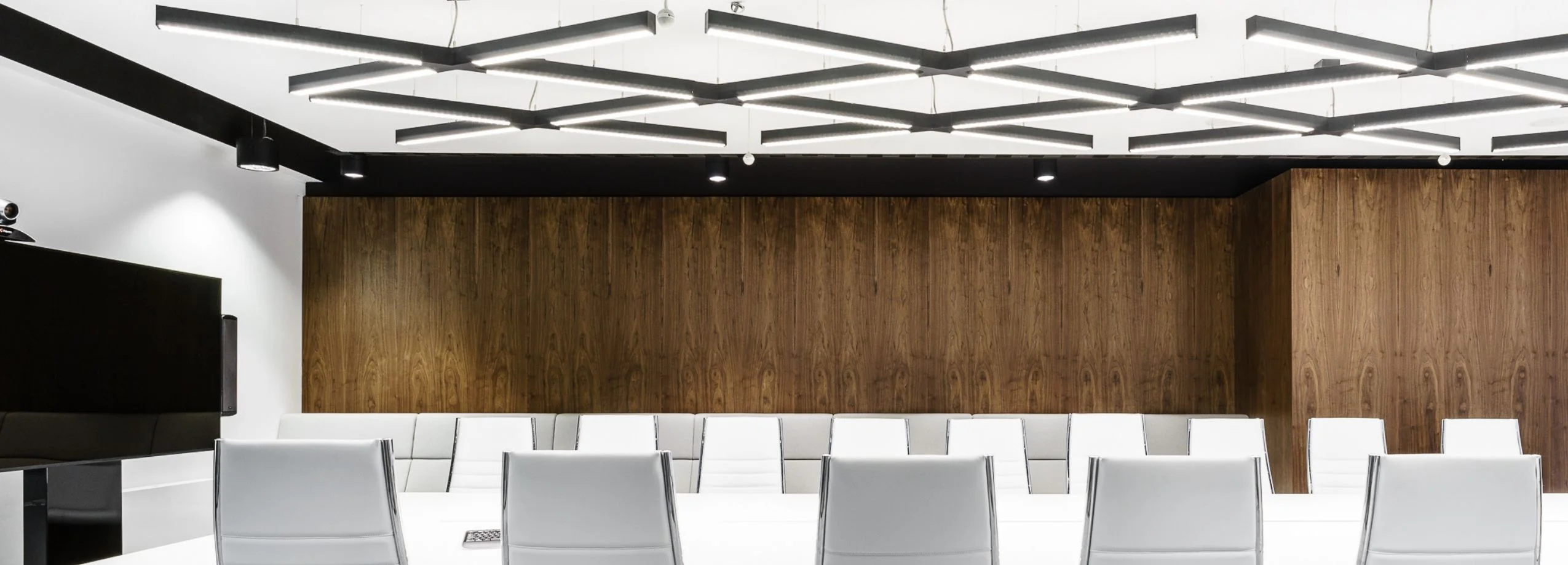
Consider a simple example. A meeting room contains a walnut conference table, dark green upholstered chairs, warm grey walls and several indoor plants. Under one LED luminaire, the wood appears rich, the green fabric looks vibrant, and the wall finish maintains its intended subtlety. Under another LED luminaire with a different spectral distribution, the walnut may appear less saturated, the upholstery may look flatter, and the overall interior may lose some of its visual depth. Both luminaires could produce the same illuminance and have the same correlated colour temperature. Their colour-rendering properties, however, may be different. This distinction is fundamental to professional office lighting design.
Understanding the CRI scale
The following table provides a practical interpretation of commonly encountered CRI values.
|
CRI (Ra) |
General interpretation |
Typical design consideration |
|---|---|---|
|
Below 70 |
Limited colour fidelity |
Generally unsuitable for occupied office interiors requiring good colour perception |
|
70–79 |
Moderate colour fidelity |
May be acceptable for selected non-critical utility applications |
|
80–89 |
Good colour fidelity |
Common specification range for general office lighting |
|
90–94 |
Very good colour fidelity |
Attractive for premium workplaces and colour-sensitive interiors |
|
95–100 |
Excellent colour fidelity relative to the reference |
Consider for specialist colour-critical tasks, subject to spectral evaluation |
These categories are practical design descriptions rather than a universal classification established by the CRI calculation itself.
A CRI of 90 does not mean that a luminaire reproduces 90% of all visible colours perfectly. It indicates the calculated average colour-rendering performance of the specified test samples relative to the reference illuminant. Furthermore, two luminaires with the same Ra value can produce different results for individual colours. That is why professional lighting designers should understand both the strengths and limitations of the CRI system.
How is the Colour Rendering Index measured?
CRI is defined through the CIE colour rendering method, traditionally associated with CIE 13.3. The method compares how selected standard colour samples appear under a test light source and a reference illuminant of the same correlated colour temperature. The reference changes with the light source's colour temperature.
For lower colour temperatures, the reference is based on a Planckian radiator, while higher colour temperatures use a daylight reference. The calculation produces individual colour rendering indices, usually identified as R1 through R14. The general colour rendering index, Ra, is calculated from the first eight samples:
These eight samples represent moderately saturated colours. The additional special colour rendering indices describe performance for other samples, including more saturated colours. This distinction matters for professional specifications. A luminaire may achieve Ra 90 while performing less effectively for a specific saturated red or blue. Consequently, treat Ra as an important starting point rather than a complete description of colour quality.
Why R9 matters
One of the most useful supplementary values is R9, which represents the rendering of a saturated red test colour. Red rendering influences the appearance of many familiar objects and materials, including certain skin tones, red textiles, timber finishes and decorative elements. Standard Ra does not include R9. As a result, two luminaires with similar CRI values may reproduce saturated reds differently. For projects where natural skin appearance, hospitality-inspired interiors, or rich material palettes matter, it can be useful to request both Ra and R9 values. A high R9 value does not guarantee perfect skin-tone rendering, but it provides additional information beyond the general CRI figure.
For premium office projects, a specification might therefore request:
-
General colour rendering index Ra ≥90.
-
A declared R9 value appropriate to the project's visual requirements.
-
Consistent colour appearance across installed luminaires.
-
Spectral performance information where colour fidelity is especially important.
-
Photometric and technical documentation from the manufacturer.
These requirements help transform a general preference for high-quality light into a measurable lighting specification.
Why CRI matters in modern office design
Colour rendering is sometimes treated as a secondary technical parameter, particularly when office lighting is evaluated primarily by lux levels and energy consumption. From an architectural perspective, however, office lighting quality is closely connected to how accurately the interior is visually communicated. An office is a composition of materials, colours, surfaces, proportions and light. Lighting determines how these elements are perceived.
A carefully selected carpet, timber veneer, or upholstery fabric can look very different under artificial illumination than in the design studio or showroom where it was originally approved. Poor colour rendering can weaken the relationship between materials and compromise the intended aesthetic.
High-quality colour rendering can help preserve the interior's character. This is especially important in contemporary workplaces, where design frequently communicates brand identity, organisational culture and the desired employee experience.
Colour fidelity and visual hierarchy
Architects use colour contrast to establish visual hierarchy. A darker wall may create depth. A warm timber surface may introduce comfort. A coloured acoustic panel may define a collaboration zone. If the light source renders these colours poorly, the intended hierarchy can become less effective.
The space may appear flatter or less coherent. A high-CRI office light can help maintain the intended relationships between materials and finishes, although the final appearance will also depend on illuminance, colour temperature, surface reflectance, and surrounding colours.
Colour rendering and perceived quality
Premium interiors often rely on subtle differences between materials. For example, a sophisticated workplace might combine limestone, brushed metal, natural oak, textured fabric and carefully selected paint finishes. These materials may have similar brightness values but different spectral reflectance characteristics. Under a light source with inadequate spectral coverage, their visual differences can become less apparent. High-quality colour rendering helps preserve those distinctions, allowing the interior to express its intended richness and detail. This is one reason to discuss CRI early in the design process rather than only during luminaire procurement.
CRI 80 vs CRI 90: What is the real difference?
One of the most common technical questions in office lighting design is whether a CRI of 80 is sufficient or whether CRI 90 should be specified. The answer depends on the space's function, the materials used, and the required level of colour fidelity. A luminaire with Ra 80 can provide good colour rendering for many ordinary office tasks. A luminaire with Ra 90 generally offers improved average colour fidelity against the reference illuminant. However, the difference is not always equally visible. In an office dominated by neutral white walls, grey furniture and standard computer-based tasks, the improvement may be relatively subtle. In an interior with natural timber, coloured textiles, artwork, and carefully coordinated finishes, the difference can be more noticeable.
CRI 80 vs CRI 90: Specification comparison
| GENERAL OFFICE | PREMIUM OFFICE |
| Ra 80+ | Ra 90+ |
| Good general colour rendering | Higher colour fidelity |
| Often suitable for routine office tasks where colour discrimination is not critical. | Worth considering where material appearance, brand colours and visual presentation are priorities. |
Is CRI 90 always better?
For colour fidelity, a higher Ra value is generally desirable, but it should not be treated as the only measure of lighting quality. A CRI 90 luminaire with poor glare control may provide a less comfortable working environment than a well-designed CRI 80 luminaire with excellent optical performance. Similarly, a high-CRI luminaire with inadequate illuminance or poor uniformity may fail to support the visual task. The correct approach is to evaluate colour rendering as one part of a complete lighting specification.
Does CRI 90 use more energy?
Not necessarily, but there can be a trade-off. Some high-CRI LED packages have lower luminous efficacy than comparable lower-CRI packages because their spectral output is optimised differently. The actual difference depends on LED technology, phosphor formulation, operating conditions and luminaire design. When comparing products, designers should examine complete luminaire efficacy in lumens per watt, not just LED package performance. A well-engineered CRI 90 luminaire may still offer excellent energy efficiency.
How CRI influences the appearance of office materials
One of the most important applications of high-quality colour rendering is accurately perceiving architectural materials. Office interiors increasingly combine natural, industrial and decorative finishes. Each material interacts with light differently.
Natural wood and timber veneers
Wood is particularly sensitive to the spectral composition of light. Oak, walnut, ash and other timber species contain complex colour variations that contribute to their natural appearance. With good colour rendering, these variations can remain visually distinct. Warm timber may retain its richness, while lighter woods preserve subtle tonal differences. Poor colour rendering may make some timber finishes appear less saturated or alter their perceived warmth. The final effect also depends strongly on colour temperature. For example, a 3000K luminaire with CRI 90 and a 4000K luminaire with CRI 90 can both render colours faithfully relative to their respective references, yet produce different overall atmospheres. CRI and colour temperature must therefore be considered together.
Upholstery and acoustic fabrics
Modern offices frequently use fabric-covered furniture, acoustic panels and upholstered partitions. These materials are often selected as part of a coordinated interior colour palette. Deep greens, muted blues, terracotta tones and warm neutrals can be particularly sensitive to changes in illumination. A high CRI office light can help maintain the intended appearance of these materials. This becomes especially important in spaces where furniture and acoustic products are central design elements, such as meeting rooms, collaboration areas and reception lounges.
Painted walls and decorative finishes
Architectural paints can contain complex pigment combinations. Two paint samples that appear similar under one light source may look different under another, a phenomenon related to metamerism. Colour rendering is therefore important when specifying decorative wall finishes. Lighting designers should ideally review material samples under the actual proposed light source and colour temperature. A technical datasheet alone cannot fully predict every material interaction.
Natural stone and concrete
Stone, terrazzo and architectural concrete often rely on subtle variations in tone and texture. Lighting with good colour fidelity can help preserve the intended appearance of coloured aggregates, mineral inclusions and surface treatments. However, light direction also strongly influences how texture is perceived. Grazing light may reveal surface relief, while diffuse lighting can create a softer, more uniform appearance. For these materials, consider CRI alongside beam distribution, light direction, and surface brightness.
Metals and reflective surfaces
Brushed aluminium, stainless steel, brass and bronze are common in contemporary workplaces. Their appearance depends on both spectral reflectance and the surrounding environment reflected by the surface. High-quality colour rendering can help preserve the intended colour character of these materials, while appropriate luminaire positioning controls highlights and reflections. For highly reflective surfaces, optical design may influence visual comfort more than CRI alone.
High CRI office lighting and human appearance
Office lighting does not illuminate architecture alone. It also illuminates people. The appearance of faces and skin tones is particularly relevant in meeting rooms, reception areas, executive offices and collaboration spaces. Human skin reflects light across a broad range of wavelengths, and its perceived colour depends on the light source's spectral characteristics. Lighting with good colour rendering can support more natural skin tones. This matters in face-to-face communication, where people constantly interpret facial expressions and subtle visual cues. However, a high CRI value does not automatically guarantee flattering facial illumination. The direction, softness and distribution of light are equally important. A luminaire positioned directly above a conference table may create strong shadows around the eyes and nose, even with excellent colour rendering. Professional lighting design therefore combines spectral quality with appropriate vertical illumination.
CRI and video conferencing
Hybrid meetings introduce additional considerations. The lighting must work for both people in the room and participants viewing the meeting through a camera. A good video-conferencing lighting design should consider:
-
Adequate vertical illuminance on participants' faces.
-
Balanced light distribution to avoid strong facial shadows.
-
Consistent colour temperature across the main lighting sources.
-
Good colour rendering for natural skin appearance.
-
Flicker characteristics compatible with camera equipment.
-
Control of excessive contrast between faces, screens and windows.
High CRI lighting can improve colour reproduction, but camera white balance, exposure, sensor characteristics, and display calibration also influence the final image. For this reason, view CRI 90 as a potentially valuable specification rather than a guarantee of perfect video quality.
CRI and Colour Temperature: Two different lighting parameters
CRI is frequently confused with correlated colour temperature, or CCT. Although both describe aspects of light colour, they measure different characteristics. Colour temperature describes the apparent colour of the emitted white light. CRI describes how faithfully that light renders the colours of objects compared with a reference. A luminaire can therefore be warm and high-CRI, cool and high-CRI, warm and low-CRI, or cool and low-CRI.
For example:
|
CCT |
Typical appearance |
Possible CRI |
Office application |
|---|---|---|---|
|
2700K |
Very warm white |
90+ |
Hospitality lounges and relaxation areas |
|
3000K |
Warm white |
90+ |
Reception, executive offices and premium meeting rooms |
|
3500K |
Balanced white |
90+ |
Collaborative workspaces and boardrooms |
|
4000K |
Neutral white |
80+ or 90+ |
Open-plan offices, workstations and focus rooms |
|
5000K |
Cool white |
90+ |
Selected technical or colour-sensitive work areas |
|
6500K |
Daylight-like white |
90+ |
Specialist inspection or colour evaluation applications |
These are possible specifications, not guaranteed product combinations.
Why a 3000K CRI 90 luminaire differs from a 4000K CRI 90 luminaire
Both sources may have excellent colour-rendering performance relative to their references. However, their visual character will still be different.
The 3000K source produces a warmer overall appearance.
The 4000K source creates a more neutral visual impression.
Neither is universally better. A warm executive lounge with timber furniture may benefit from 3000K, while a technical workspace may suit 4000 K better. In both cases, high CRI can help preserve the intended appearance of materials.
Can mixing colour temperatures affect colour perception?
Yes. When different colour temperatures illuminate the same space, surfaces can appear inconsistent. For example, a timber wall illuminated by 3000K accent lighting may appear noticeably warmer than the same material under adjacent 4000K general lighting. This can be intentional in hospitality-inspired design. However, uncontrolled mixing can create visual fragmentation. Professional designers should coordinate CCT values carefully and verify material appearance under the proposed lighting scheme.
Recommended CRI values for different office zones
Not every office area requires the same colour-rendering specification. The best approach is to consider the visual tasks, interior materials, architectural character, and occupants' expectations. The following recommendations provide a practical starting point.
|
Office zone |
Suggested CRI |
Typical CCT |
Main consideration |
|---|---|---|---|
|
Open-plan workstations |
Ra ≥80; Ra ≥90 for enhanced colour fidelity |
3500–4000K |
Comfortable general work |
|
Executive offices |
Ra ≥90 |
3000–3500K |
Premium materials and appearance |
|
Boardrooms |
Ra ≥90 |
3000–4000K |
Faces, finishes and presentation |
|
Video conference rooms |
Ra ≥90 |
3500–4000K |
Skin tones and camera performance |
|
Reception areas |
Ra ≥90 |
3000–3500K |
Brand identity and first impressions |
|
Collaboration zones |
Ra ≥90 where materials and colours are important |
3000–4000K |
Welcoming visual environment |
|
Focus rooms |
Ra ≥80 or ≥90 |
3500–4000K |
Task visibility and comfort |
|
Break rooms and cafés |
Ra ≥80; Ra ≥90 for design-led interiors |
2700–3000K |
Warmth and material appearance |
|
Design and sample review rooms |
Ra ≥90, with additional spectral assessment |
Task-dependent |
Accurate colour discrimination |
|
Circulation areas |
Ra ≥80 |
3000–4000K |
Consistency and orientation |
These values are design recommendations, not universal regulatory requirements. Final specifications should reflect the relevant lighting standards and the actual tasks performed.
Open-plan offices
Open-plan offices require consistent lighting conditions across large working areas. In many projects, Ra 80 provides an acceptable starting point for routine computer-based tasks. However, premium office developments may choose Ra 90 to create greater consistency between workstations, meeting areas and architectural features. The decision should also account for luminaire efficacy, glare control and maintenance requirements.
Executive offices
Executive offices frequently contain natural timber, decorative furniture, artwork and carefully selected finishes. Here, high colour rendering can contribute significantly to the perceived quality of the interior. Ra 90 or higher is often a sensible design target.
Boardrooms
Boardrooms combine visual tasks with interpersonal communication. Participants need to read documents, view presentations and communicate comfortably. High CRI supports the appearance of faces and materials, while good vertical illumination and glare control remain essential.
Reception areas
Reception spaces often communicate a company's visual identity. Brand colours, decorative surfaces, furniture and architectural features may all play important roles. High CRI lighting can help preserve the intended colour relationships. For reception areas with strong design ambitions, Ra 90 is a reasonable specification to consider.
Creative studios and material libraries
Creative environments may require more demanding colour evaluation. Architects, designers and material specialists often compare paint samples, fabrics, printed materials and finishes. In these situations, Ra alone may not provide sufficient information. Additional metrics, controlled viewing conditions and calibrated reference lighting may be necessary.
Is CRI 90 necessary for every office?
A common misconception is that the highest available CRI should automatically be specified throughout an entire office building. In reality, good lighting design requires a balance between visual performance, energy efficiency, cost and architectural intent. Ra 90 may offer clear advantages in premium spaces and areas where colour perception matters. However, Ra 80 may be entirely appropriate for general office environments where colour discrimination is not critical.
A useful strategy is to establish different specification levels across the project. For example, a workplace might use Ra 80 or higher for general circulation and routine workstations, while specifying Ra 90 or higher for reception areas, boardrooms, executive offices and material presentation spaces. This approach lets the design team allocate resources based on each area's visual importance. It also avoids treating CRI as an isolated performance target.
When to prioritise CRI 90+
Higher colour rendering is particularly valuable when:
-
The interior contains natural timber, richly coloured fabrics or decorative finishes.
-
Brand colours must be presented consistently.
-
People and faces are central to the visual experience.
-
The workplace includes artwork or material displays.
-
Architects require greater confidence in the appearance of specified finishes.
-
The project has a premium architectural or hospitality-inspired character.
For ordinary administrative areas, the difference between Ra 80 and Ra 90 may matter less than improving glare control, lighting uniformity, or task illuminance. Base the final decision on the complete visual environment.
CRI is not the whole story: Understanding TM-30
Although CRI remains widely used in lighting specifications, it has limitations. Traditional Ra calculations are based on only eight moderately saturated colour samples. It does not fully describe a light source's behaviour across the full range of colours found in real interiors. For more detailed evaluation, lighting professionals can use additional methods such as ANSI/IES TM-30.
TM-30 evaluates colour rendition using a larger set of colour evaluation samples and provides two important metrics:
Rf - Fidelity Index
Rf describes how closely colours under the test light source match those under a reference illuminant. A higher Rf indicates greater overall colour fidelity.
Rg - Gamut Index
Rg describes the average relative saturation of colours under the test source compared with the reference. Values around 100 indicate similar average gamut area. Values above or below 100 indicate an overall increase or decrease in gamut area, respectively.
These two metrics provide a more detailed understanding of colour performance than Ra alone. For example, two luminaires may have similar CRI values but different TM-30 fidelity and gamut characteristics. This can affect how saturated materials appear.
Why TM-30 is useful for premium offices
In a design-led office, colour quality is not simply about avoiding obvious colour distortion. It is also about maintaining subtle relationships between materials. TM-30 can help designers evaluate whether a light source preserves the intended colour palette or shifts the saturation of certain hues. For highly demanding projects, designers may also review the TM-30 colour vector graphic and local colour fidelity data. These tools can reveal differences that are not apparent from a single CRI number. Nevertheless, TM-30 should complement, not replace, practical mock-ups and visual assessment.
CRI, Glare and visual comfort
A technically excellent CRI value does not guarantee comfortable office lighting. Visual comfort depends on several interacting parameters. One of the most important is glare. Direct glare occurs when excessively bright luminaires or surfaces enter the field of view. Reflected glare can occur when light sources are reflected in computer screens, glossy desks or other surfaces. Both can interfere with visual tasks. Professional office lighting design therefore considers the Unified Glare Rating, or UGR, where applicable.
For many office workstation applications, relevant standards commonly specify a limiting UGR value of 19, although the correct requirement depends on the task and application.
Why CRI and glare must be evaluated together
Consider two luminaires. The first has Ra 95 but produces uncomfortable glare. The second has Ra 90 and excellent optical control.
For a typical office workstation, the second may provide a better overall visual environment. The difference illustrates why office lighting quality cannot be reduced to a single number.
A complete specification should consider colour rendering, glare, illuminance, uniformity, colour temperature and luminaire placement.
CRI and illuminance: Why more light is not always better
Illuminance describes the amount of light falling on a surface and is measured in lux. CRI describes the light source's colour-rendering properties. These parameters are independent. A luminaire can provide high illuminance with poor colour rendering, or excellent colour rendering with insufficient illuminance. Both situations may be unsuitable. For many conventional office desk tasks, 500 lux is a commonly referenced maintained illuminance target under European workplace lighting practice, although the applicable requirement depends on the task and current standard. Lighting designers should evaluate the specific work being performed rather than applying one value indiscriminately. Increasing illuminance does not necessarily compensate for poor colour rendering. Similarly, specifying CRI 95 does not eliminate the need to provide adequate task lighting. A successful design balances both.
The importance of uniformity
Uniformity describes how evenly light is distributed across the relevant area. Poor uniformity can create uncomfortable differences between bright and dark zones. In open-plan offices, appropriate uniformity helps maintain consistent working conditions. Therefore, pair high CRI with carefully designed light distribution.
Colour Consistency: Why Two CRI 90 Luminaires May Look Different
Even when two luminaires have the same CRI and nominal colour temperature, they may not appear identical. One reason is chromaticity variation. LED products are commonly classified according to colour consistency tolerances, often expressed using MacAdam ellipses or standard deviation of colour matching, abbreviated SDCM. A smaller SDCM tolerance generally indicates tighter colour consistency between light sources. This is particularly important in offices using repeated linear luminaires, continuous lighting systems or multiple fixtures within the same visual field. For example, a long row of ceiling-mounted luminaires may reveal small colour differences that would be less noticeable if the fixtures were installed separately.
Recommended design approach
For visually demanding office interiors, designers may consider specifying 3 SDCM or tighter, depending on the product range and project requirements. Evaluate colour consistency alongside CRI and CCT. A luminaire with Ra 90 and poor colour consistency may create a less coherent environment than a carefully matched installation with slightly lower CRI. This is another reason to request complete technical data rather than relying on a single headline specification.
High CRI office lighting and daylight
Daylight is an important reference for architectural lighting design. It provides changing spectral and directional characteristics throughout the day. However, daylight is not constant. Its colour temperature and spectral distribution vary with weather conditions, time of day, glazing characteristics and orientation. Artificial lighting must therefore be designed to work alongside changing natural illumination.
Does daylight have CRI 100?
Daylight reference illuminants are used within the CRI system for certain colour temperature ranges, so the relevant reference has perfect fidelity to itself by definition. However, actual daylight varies and is not a single fixed spectral distribution. Furthermore, daylight passing through tinted or spectrally selective glazing may change its colour characteristics. The practical implication is that high-CRI artificial lighting can support consistent material appearance when daylight is reduced, but it will not make an interior look identical under all daylight conditions.
Daylight-responsive lighting
Modern office lighting systems may incorporate daylight sensors and dimming controls. These systems can reduce artificial lighting output when sufficient daylight is available. In premium workplaces, tunable-white lighting may also adjust colour temperature. However, designers should verify how colour-rendering performance changes across the tunable range. A luminaire advertised as high-CRI at one CCT may not necessarily maintain identical performance at every setting.
CRI and human wellbeing: What the metric does and does not tell us
High-quality lighting is an important component of a comfortable workplace. However, it is essential to distinguish between established technical performance and broader claims about health or productivity. CRI measures colour fidelity. It does not directly measure circadian effectiveness, alertness, visual fatigue or employee productivity. These outcomes depend on multiple factors, including illuminance, spectral distribution, timing, exposure duration, daylight access, glare, and individual characteristics. A high-CRI luminaire may improve the appearance of colours without necessarily improving concentration. Similarly, a luminaire with excellent CRI may have very different non-visual biological effects from another source with the same CRI. For projects involving circadian lighting strategies, designers should consider appropriate spectral and melanopic metrics rather than using CRI as a substitute.
What can reasonably be expected from high CRI?
The strongest practical argument for high CRI is improved colour fidelity. This can contribute to:
-
More accurate perception of architectural finishes.
-
Better visual presentation of coloured materials.
-
More natural appearance of faces and objects.
-
Greater confidence in colour-sensitive tasks.
-
More faithful communication of the intended interior design.
These are meaningful benefits without unsupported claims about productivity or health.
How to specify high CRI office lighting in a professional project
A professional lighting specification should clearly define the required performance. Instead of simply requesting 'high-quality LED lighting', the designer should establish measurable criteria. For a premium office, the specification may include:
|
Parameter |
Example project target |
Why it matters |
|---|---|---|
|
General colour rendering |
Ra ≥90 |
High average colour fidelity |
|
Special red rendering |
R9 value declared; project-specific minimum |
Additional information on saturated red |
|
Colour temperature |
3000K, 3500K or 4000K |
Appropriate atmosphere and task support |
|
Colour consistency |
≤3 SDCM |
Consistent appearance across luminaires |
|
Glare control |
UGR limit appropriate to task |
Visual comfort |
|
Maintained illuminance |
According to task and applicable standard |
Adequate visibility |
|
Lighting uniformity |
According to task and applicable standard |
Consistent working conditions |
|
Luminaire efficacy |
Project-specific lm/W target |
Energy performance |
|
Flicker performance |
Suitable for occupants and intended cameras |
Comfort and video compatibility |
|
Photometric documentation |
IES or LDT files |
Lighting calculation and verification |
These are example specification criteria, not a universal product standard. The exact requirements should be coordinated with the project brief, local regulations and applicable lighting standards.
Sample specification wording
For a premium office project, a designer might use the following wording:
General lighting luminaires shall provide a minimum general colour rendering index of Ra 90 at the specified correlated colour temperature. The manufacturer shall declare the R9 value and provide relevant photometric and colourimetric technical documentation. Colour consistency shall be 3 SDCM or better where required by the project. Final luminaire selection shall also satisfy the applicable illuminance, uniformity, glare and energy-performance criteria.
This approach makes it easier to compare alternative products objectively.
How to read a high CRI LED luminaire datasheet
Technical datasheets are essential when selecting professional office luminaires. However, manufacturers don't always present the information consistently. Some datasheets provide only a general CRI value. Others include R9, colour temperature options, colour consistency, photometric files and detailed spectral information. When evaluating a product, lighting designers should verify the following.
Declared CRI value
Check whether the product is specified as Ra 80, Ra 90 or another value. Confirm that the value applies to the exact LED configuration being ordered.
Available colour temperatures
A luminaire family may offer 3000K and 4000K options, but not necessarily 3500K. Different CCT versions may also have different lumen outputs or colour-rendering characteristics.
R9 performance
If colour fidelity is particularly important, request the R9 value. Do not assume that a high Ra automatically guarantees high saturated-red rendering.
Colour consistency
Check whether the manufacturer declares SDCM or an equivalent colour tolerance.
Photometric performance
Review luminous flux, power consumption, efficacy and optical distribution.
Glare characteristics
Verify whether the luminaire suits the intended workstation arrangement.
Dimming and controls
Confirm compatibility with the specified control system, such as DALI or another supported interface.
Product-specific documentation
A general product-family description may not apply to every available configuration. The final specification should identify the precise variant, colour temperature, optics and control option.
Professional office lighting solutions from flexxica
Selecting professional luminaires involves balancing colour quality, architectural appearance, visual comfort and technical performance.
For designers developing contemporary office environments, the flexxica Professional Lighting collection provides a starting point for exploring architectural lighting solutions.
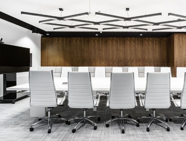
Professional lighting for contemporary workplaces
When reviewing the Flexxica range, architects and lighting designers should compare the available luminaire configurations against the project specification, including colour rendering, CCT, optical performance and installation requirements.
Explore flexxica Professional Lighting
Selecting flexxica products with CRI above 90
For projects requiring Ra greater than 90, the first step is to identify which current Flexxica product configurations meet that requirement. The distinction between Ra ≥90 and Ra >90 is important. A product rated at exactly Ra 90 meets a minimum Ra 90 specification but does not satisfy a strict requirement for a value greater than 90. Check product datasheets for the declared value and any relevant tolerances. The following information should be verified before specifying a particular model:
-
Exact product name and configuration.
-
Declared CRI or Ra value.
-
Available CCT options.
-
Luminous flux and luminaire efficacy.
-
Optical distribution and glare performance.
-
Colour consistency.
-
Available dimming and control systems.
-
Photometric files and installation requirements.
If a datasheet does not provide sufficient information, ask the manufacturer to confirm the relevant technical parameters. This verification is particularly important for premium projects where high colour fidelity is part of the architectural brief.
Integrating high CRI lighting with office interiors
Professional lighting should complement the space's design rather than compete with it. In an open-plan office, linear luminaires can provide a consistent architectural rhythm while supporting general illumination. In executive offices, decorative or architectural fixtures may become part of the interior's visual identity. In meeting rooms, lighting must support communication, material appearance and visual comfort. For each application, the lighting designer should evaluate the complete luminaire system rather than treating CRI as a standalone product feature.
Common mistakes when choosing CRI office lighting
Even experienced project teams can overlook important details when specifying colour rendering.
Mistake 1: Assuming higher CRI automatically means better lighting
High CRI is valuable, but it cannot compensate for poor glare control, inadequate illuminance or unsuitable light distribution. Evaluate the entire lighting system.
Mistake 2: Confusing CRI with colour temperature
A 4000K luminaire is not automatically more colour-accurate than a 3000K luminaire. CCT and CRI describe different characteristics.
Mistake 3: Ignoring R9
Two luminaires with similar Ra values may render saturated reds differently. For projects involving rich fabrics, skin tones or decorative finishes, supplementary colour-rendering information can be useful.
Mistake 4: Comparing luminaires only by wattage
Power consumption does not describe colour fidelity or visual comfort. A meaningful comparison should include luminous flux, efficacy, CRI, CCT, optics and control capabilities.
Mistake 5: Assuming all CRI 90 LEDs look identical
Different spectral power distributions can produce different colour appearances even when Ra values are similar. Consider colour consistency and additional colour metrics.
Mistake 6: Ignoring material mock-ups
Technical values cannot fully predict how every material will appear in the finished interior. Where possible, test the proposed lighting with actual material samples.
Mistake 7: Specifying high CRI without checking the exact product variant
A luminaire family may contain multiple LED options. Verify the selected configuration against the required performance.
The future of colour rendering in office lighting
As LED technology continues to develop, lighting designers have access to increasingly sophisticated methods of evaluating spectral quality. CRI remains widely recognised and useful, but more detailed metrics are becoming important in professional specifications. TM-30 provides additional insight into colour fidelity and gamut. Spectral power distribution data allow designers to investigate the characteristics of the emitted light more closely. Tunable-white and multi-channel LED systems introduce further opportunities to adapt lighting conditions, although their colour-rendering performance must be evaluated across the full operating range. At the same time, workplace interiors are becoming more material-rich and visually diverse. Natural timber, recycled fabrics, coloured acoustic elements, decorative surfaces and biophilic design features all increase the importance of faithful colour reproduction. For these reasons, high CRI office lighting is likely to remain an important consideration in premium architectural lighting design. However, CRI alone will not define the future of office lighting quality. The strongest solutions will combine accurate colour rendering with good optical control, efficient performance, appropriate light distribution, intelligent controls and careful integration with architecture.
Practical Checklist: Choosing the right CRI for an office project
Before finalising a lighting specification, architects and lighting designers should review the following questions.
This process helps ensure that colour rendering is considered as part of a coherent lighting strategy rather than as an isolated technical requirement.
Frequently Asked Questions About CRI Office Lighting
What is CRI in office lighting?
CRI, or colour rendering index, is a metric that describes how faithfully a light source renders the colours of objects compared with a defined reference illuminant. In office lighting, it helps designers evaluate how naturally furniture, materials, finishes and people will appear under artificial light.
What is a good CRI for office lighting?
A CRI of 80 or higher is commonly suitable for general office lighting. A CRI of 90 or higher is worth considering for premium workplaces, executive offices, meeting rooms, reception areas and environments where accurate colour perception is particularly important.
Is CRI 90 better than CRI 80?
CRI 90 generally indicates higher average colour fidelity than CRI 80 when evaluated against the relevant reference. However, the visible difference depends on the spectral characteristics of the sources and the colours being illuminated. Overall lighting quality also depends on glare, illuminance, uniformity and other factors.
Is CRI 95 necessary for office lighting?
CRI 95 is not generally necessary for routine office tasks. It may be useful in specialist environments involving colour evaluation, material selection or demanding visual presentation. For these applications, consider additional colour metrics.
What is the difference between CRI and CCT?
CRI describes colour-rendering fidelity, while correlated colour temperature describes whether white light appears warm or cool. A luminaire can have a colour temperature of 3000K or 4000K and still achieve a high CRI.
Does high CRI office lighting improve productivity?
High CRI can improve colour-perception fidelity, but CRI alone is not a reliable predictor of productivity. Workplace performance is influenced by numerous factors, including task visibility, glare, lighting levels, daylight access and environmental comfort.
Does CRI affect skin tones?
Yes. A light source's spectral distribution affects how skin tones appear. High CRI can support natural colour reproduction, although facial illumination, CCT and camera characteristics also influence the final appearance.
Why is R9 important in LED lighting?
R9 measures the rendering of a saturated red test colour and is not included in the standard Ra average. It provides additional information about how a light source reproduces red hues, which can matter for skin tones, textiles, and decorative materials.
Can two LED lights with the same CRI look different?
Yes. Two luminaires can have the same CRI but different spectral power distributions. They may render individual colours differently or exhibit differences in colour temperature and chromaticity. This is why additional metrics and physical mock-ups can be valuable.
What CRI is best for meeting rooms?
Ra 90 or higher is a useful design target for premium meeting rooms and boardrooms, especially where natural facial appearance and accurate material colours are priorities. However, glare control and vertical illumination are equally important.
Is high CRI lighting more expensive?
High-CRI LED products may cost more and be less efficient than standard options, but the difference depends on the manufacturer and luminaire design. Base the decision on overall product performance and project requirements.
Where can I find professional high CRI office luminaires?
Professional lighting manufacturers provide technical documentation for their products. Designers can explore the flexxica Professional Lighting range and review individual product datasheets to identify configurations that meet their required CRI and other performance criteria.
Why colour rendering deserves more attention in office lighting design
The colour rendering index is one of the most important parameters influencing how an office interior is visually experienced. It affects how we perceive natural materials, decorative finishes, furniture, architectural surfaces, and people. In contemporary workplaces, where interior design increasingly reflects brand identity and organisational culture, faithful colour reproduction can meaningfully contribute to the overall quality of the environment. For general office applications, Ra 80 remains a common and often appropriate specification. For premium interiors, executive offices, boardrooms, reception areas and colour-sensitive environments, Ra 90 or higher can provide valuable improvements in colour fidelity. However, selecting a high CRI office light should never be treated as a substitute for complete lighting design. The best results come from combining colour rendering with appropriate colour temperature, illuminance, glare control, uniformity, colour consistency and energy efficiency.
Architects and lighting designers should also consider supplementary metrics such as R9 and TM-30 when colour performance is particularly important. Most importantly, evaluate lighting in relation to the materials, people, and activities within the space. A successful office lighting scheme does not simply illuminate the workplace. It reveals the architecture, preserves the character of materials and supports a coherent visual experience.
For professionals specifying luminaires for contemporary workplaces, the flexxica Professional Lighting collection offers a range to explore, with individual technical specifications to verify against each project's colour-rendering and visual-performance requirements.
More news
See all
Decorative vs functional office lighting: Do you really need to choose?
Can office lighting be both visually striking and technically sophisticated?
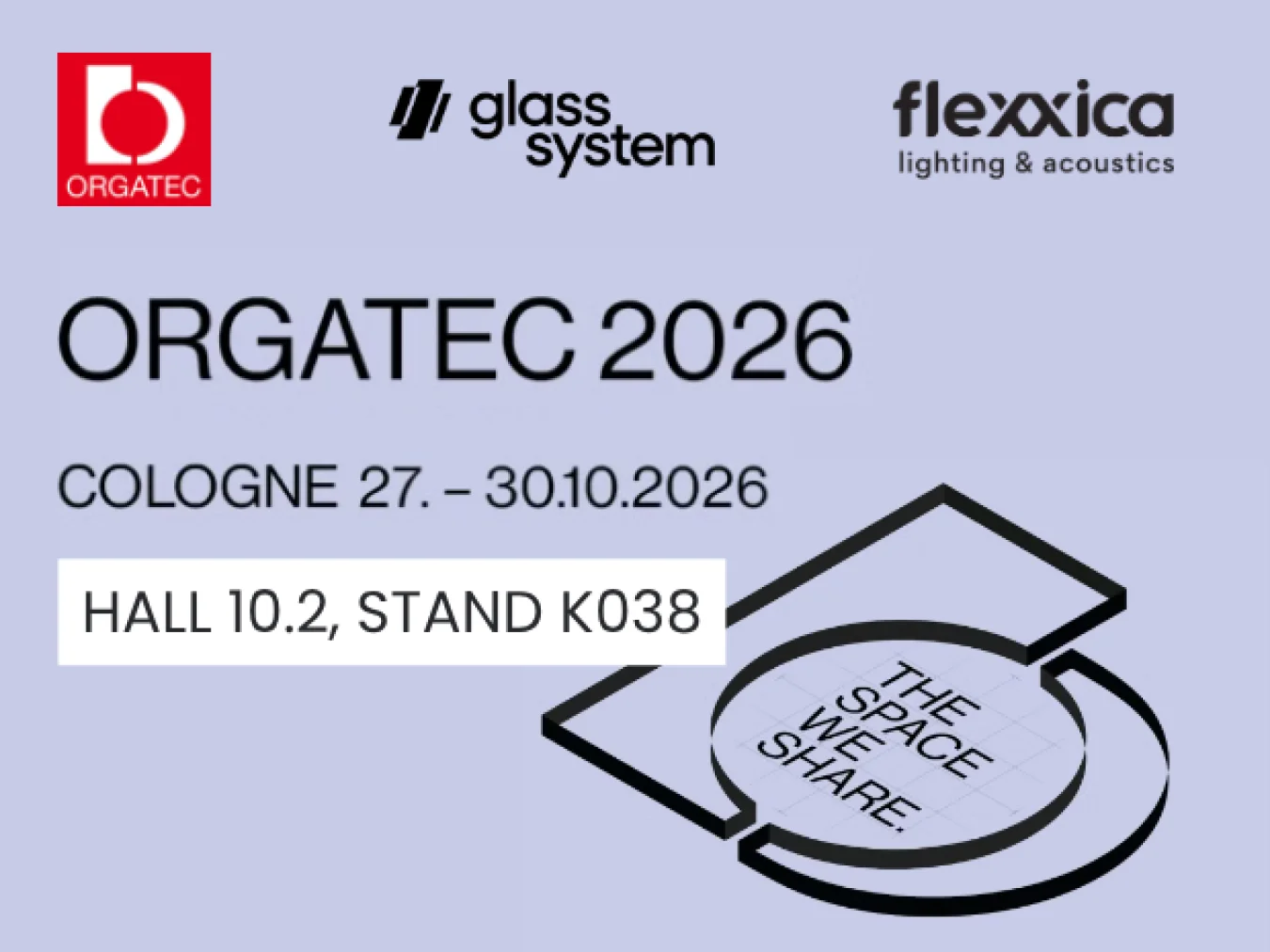
flexxica at ORGATEC 2026
See flexxica products at ORGATEC 2026, taking place from October 27–30, 2026, at the Koelnmesse trade fair centre in Cologne, at the Glass System stand.


